Monday, January 31, 2011

Three websites


I dig this website because it is very simplistic, yet interesting.  It uses a simple black background and adds some interest with it's scrolling art work, and it's crazy scribble text.  When I look at a website what really gets me is the typography, which is part of the reason I love this website.  Very simple, with a little flare.
http://basquiat.com/


I like this website because it is very representative of jack and the music he plays.  I like that the website reminds me of the ocean.  It has cool text, and a very cool background.  It reminds me of the board walk and really mellows me out, much like jack's music does.
http://jackjohnsonmusic.com/welcome/

I l<3ve this website because I think that black, white, and red are very aesthetically pleasing.  I love the text that is used and stack on the side navigation bar.  I also like how the web page is mainly set up in the middle of the browser.  It makes it very simplistic and easy to read.  
http://www.girlskateboards.com/

Three Website Choices

I found this site browsing "Pearl Jam" while listening to it of course, and it's a pretty sweet site that allows you to listen to their music for free and provides a pretty cool puzzle thing to keep you busy!


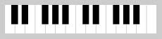
I chose this link because it is simply...really fun :) It is like GarageBand for all you mac users, just a little less technical. You can play around like you are actually on the piano!


I chose this specific website for a couple of different reasons. For one I adore the music, which is how i discovered it, and secondly it catches my eye. I really like the way they incorporated drawings in to the photography and how certain things are animated. It has a child-like/unique feeling to it that helps portray how her music is.


Website #3

Kumi Yamashita creates her work by using wood and other materials to make shadows of people. She also uses other mediums in her artwork such as graphite and fabric but her shadow art is by far her most unique pieces. Her website is also neat and easy to navigate through. I like that when you click to view a picture larger another window opens up. I also like that her work is grouped in the year that they were created because it shows how the artists has progressed.

http://kumiyamashita.com/

Website #2

I thought this site was interesting mainly because Dan Witz's paintings are so realistic looking. He has a whole section of paintings of mosh pits and portraits of people texting. These are two things that you don't normally see painted so I thought that was original. His site also contains a lot of information but is still neat and organized. There is also a video on the site that shows some of his street work.


http://www.danwitz.com/index.php?article_id=11

Website #1

I chose this site because the homepage really caught my attention. On the homepage is a huge picture of the artist covered in paint. The site is neat and easy to navigate through. The artist's artwork is also amazing. Instead of working on a canvas she paints people to make them look like a painting. Since her work is so unique its nice that she has more than one picture of most of her pieces.


http://www.alexameade.com/index.html

Sunday, January 30, 2011

Website #3


I chose this site for a lot of the same reasons that I chose the first two. I am attracted to websites with simple designs. In this site, everything you might need to find is listed on the top of the page as well as the artist's name. The colors featured are simply gray and white, so nothing is distracting to the artwork or readings. I like that you can always get back to where you started by clicking the artist's name.

Website #2


The second site I chose is called SwarmSketch. It is a site that chooses a topic or subject each week, and allows anyone who clicks onto the site to draw their feelings toward the subject and contribute to what other people have drawn. It is interesting to see what people can collectively come up with to represent the topic given. I also chose this site because I like the fact that the website is organized to the top left. It makes it easy to navigate throughout the site and find your way back to where you started. If I was making a website I would be very interested in setting it up similar this site.

3 Websites

This site is set up very nicely. You can view her work
very easily by clicking on the different tabs
near the top of the web page. A lot of her work is also
displayed on the homepage of the site.


I chose this website because I really like Robin
Cameron's work. I like the way the site is set up
and how some of her pieces are shown on the main page.
The site is simple and successful in design.


I really like the set up of this web page.
It is very interactive and easy to navigate through.
I really like David Hockney's work. I think his photo
collages are very interesting to the eye.

Saturday, January 29, 2011

Website 1


I chose this website because I not only enjoy his work, but I like the simple layout that the site provides. It is easy to navigate around and find what you are looking for. The colors used are muted which contributes to the simple design of the site. The site is very straight forward which makes it easy to get on, find what you are looking for, and get off. I like that in a site.

Friday, January 28, 2011


http://www.news-leader.com/article/20110128/BUSINESS04/101280348/-American-West-display-OTC-photo-exhibit?odyssey=tab|topnews|text|FRONTPAGE


This website provides the top news about photo exhibitions to people. The huge American West landscape are miraculous. The beauties of nature in the photos will impress a viewer.

http://www.blender.org/features-gallery/gallery/art-gallery/


This website consist of several different creative parts from portrait to design with digital techniques. The site has a concentration on the images, allowing them to be showcased without much distraction from other sources.

Thursday, January 27, 2011

Website #1:


http://paulahayes.com/?i=1

I chose this website because most of Paul Hayes pieces involve the beauty of the environment. I myself am very environmentally conscious and I really like the way that he displays his appreciation for it in this artworks. I also love the way the website is designed, where the links are displayed as things growing on a tree.


Website #2:


http://www.jorislaarman.com/site/info.htm

I chose this website because I like the layout of information. With every picture there is a detailed summary of the concept and how the artists achieved the finished piece. I also like the pieces presented throughout the web page and how they are related to today's technology.


Website #3:


http://www.timburton.com/

I chose this website because I really liked the way that viewer was able to "walk" through the galleries. I think this website is really creative and makes even navigating around the site very interesting.

Website #2


http://www.jonnybones.com/

This website is promoting Jon Jones. Jon is a popular young UFC fighter. He graduated in 2005 from my highschool. He still is undefeated. This site is pretty simple but is pleasing to me because he is a friend. The site itself has a lot of text to it. Many questions and answers and also some videos of his fights and interviews. Check it out and cheer for him! Next fight is the night before the Super Bowl on ppv. Order it!

Website #1


http://www.dreamworksanimation.com/

This is the DreamWorks website. I like this website because of the use of animation throughout the website. Buttons are animated by both roll over and clicking them. There are a lot of cool little things within this website itself, like games, and also the process and production of the movies. Also I like the way that the site uses the logo of a boy fishing of the moon as the loading screens. The logo is also animated. Check it out.

3 Websites- #3

Nick Russian is an artist who designs for Lib Tech snowboards. His art is amazing, wether it be snowboards designs or a painting, as I have shown. Considering he is in the field I would like to go into, he is definitely an inspiration for me.